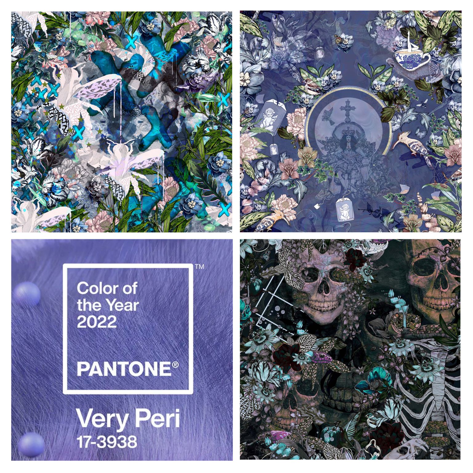
Pantone’s colour of the year 2022
V E R Y P E R I
Pantone‘s colour of the year 2022. When it comes to considering colour, it’s a lot more than just looking with our eyes. The power comes from the feelings of which it evokes. Every colour, every tone and every shade. Making the things that we don’t see, just as integral as those that we do.
Colour has the power to influence both moods and mindsets. For instance the colour purple has long being associated with Royalty therefore giving you the feeling of richness which then goes hand in hand with the luxury, power and nobility that it emanates (which works really well with our And That’s The Tea design)

Pantones colour of the year Very Peri is all of those things but also so much more, as the tone of purple chosen also reflects the spiritual side; it’s relaxing, soothing whilst the dynamic blue undertones spark creativity offering us the perfect balance. We’ve seen lilac and lavender become more dominant throughout fashion and now it’s the turn of the interiors we will see flashes and accents of Very Peri utilised in spaces, harnessing colour harmonies to evoke feelings within. I felt excited when I saw the announcement as this is a colour I can totally get to grips with and I look forward to introducing it into new works as well as seeing it throughout our existing designs. Like Spinningfields, And That’s The Tea and Frenemy Hues.
To learn more about colour and colour harmonies head down to Material Source and pay Crown Paints a visit.
#pantone#colouroftheyear2022#colour#harmonies#regal#royalty#colourharmonies#interiors#interiordesign#wallpaper#fabrics#design#surfacepatterndesign#surfacepattern#printandpattern#creativity
CREDIT : https://www.linkedin.com/in/beth-travers-8a108a98?miniProfileUrn=urn%3Ali%3Afs_miniProfile%3AACoAABSoEHkBpuvP_MbXpQfSYjdD_AOPi3hOvds&lipi=urn%3Ali%3Apage%3Ad_flagship3_detail_base%3Bm4qcnL04SsOeU2hQl2WHdA%3D%3D&licu=urn%3Ali%3Acontrol%3Ad_flagship3_detail_base-actor_container&lici=PP15mDbYRkWl91Wrxi%2FL6Q%3D%3D